Thursday, May 5, 2011

Depot Design


These are some of the final presentation boards used for my Depot design. As described previously, the point of this project was to adaptively reuse the Pufferbelly Depot in Downtown Pullman from the old railroad station and turn it into an art hotel style bed and breakfast. Throughout the process I used an inspiration photo from the depot, created a parti, a concept model and textile, all of which influenced the design. The goal of the design was to revolve around a central point and all be easily accessed from that specific point, the lobby. The lobby is centrally located within the public space, and has a curved wall behind the desk to emphasize the circular pattern I tried to create.


I think this was a successful design, however if I could do it over I would focus more of the small details. For instance, I would have put more detail into my furniture floor plan, presenting information like this successfully is crucial to the client satisfaction, so adding more detail would have been useful. Also, I have strong rendering skills, but I feel that I could have had stronger renderings and I wish I would have spent more time perfecting them, because again perspectives are extremely important when presenting to a client.




Concept Model

This is a photo of the concept model I used to help guide my design for the Pufferbelly Depot in Downtown Pullman. The idea behind this model was using a design radiating from a central point and moving outward. The artist I chose to feature in my design has a design similar using cotton Q-Tips and creating a sphere with them and then painting them to fit the theme. Much of her work focuses on using contrasting colors and abstract shapes, which I portrayed through my use of materials and the organic shapes within the design.
I think this was an extremely successful design, it portrays exactly what I had hoped it would, and my design reflects the same style.

Tuesday, April 19, 2011

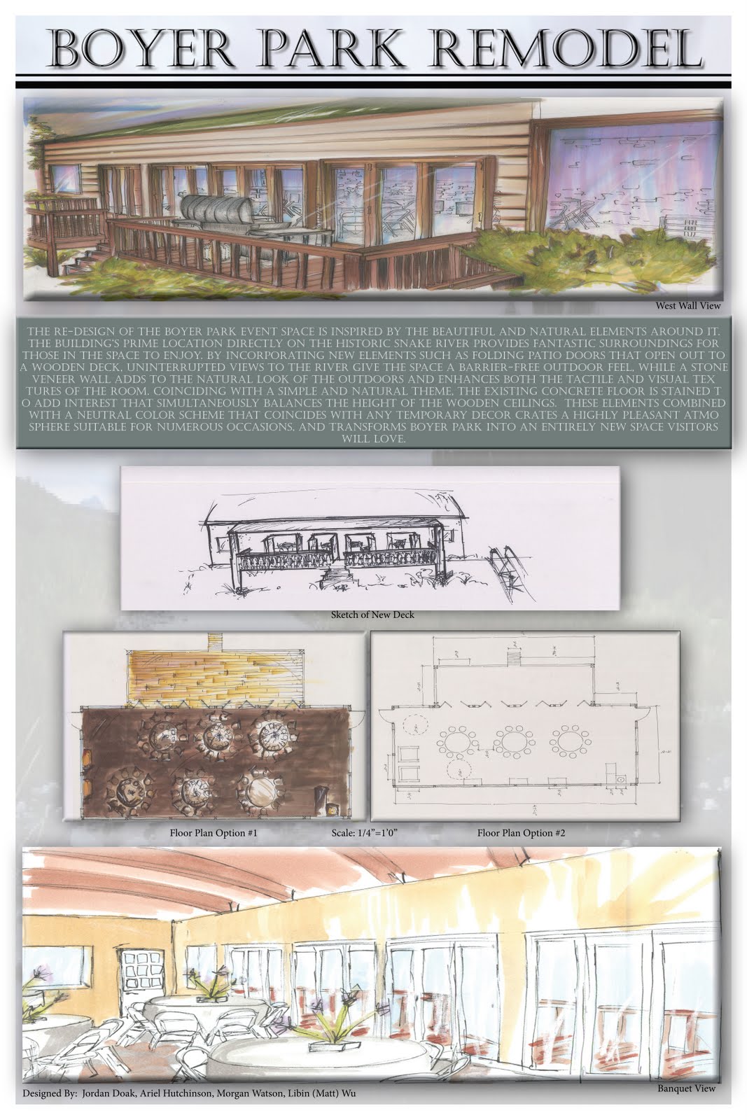
Boyer Park Design


These are the posters from the designs for the Boyer Park Remodel in the Palouse. This project was done in groups of four. Our challenge was to remodel a 48x20' space into a commercial space mainly used for weddings and receptions. Our solution was to add a stone veneer wall, and parallel from it a nana wall (a folding glass wall) that opened onto a deck.


I think our design was extremely successful, not only was it functional and aesthetically pleasing, but the clients were pleased as well. We were able to stay within budget, create a beautiful space, and make it easy to manage for the owners. I think our poster layout was successful as well, we conveyed our design ideas clearly and it is easy to look over the poster and follow our design process.


Kristie Severn

This is a poster of some of the research I did on the artist I chose to feature in my art hotel in downtown Pullman. In this poster I describe the artist, why I chose her and how I intend to use her artwork as the guiding theme for the art hotel. Knowing the artists personal statement and a bit about who she is is extremely important because it allows me to understand her art better and reasoning behind it.

I think this poster was successful, I think it was laid out well and also represents the artists work, little bits of bright color here and there. The only thing I would change would be the amount of words I put on the poster, a poster should be more pictures and less words, so if I were to do it again I would put more examples of her artwork and a more to-the-point summary.

Art Hotel Research


This poster is some of the preliminary research done for the adaptive reuse project I have been working on. The goal of the project is to turn the Pufferbelly Depot in downtown Pullman into a small bed and breakfast type art hotel.


I chose Hotel Max because I have been there and I thought it was a great example of a successful art hotel. It is in Seattle, Washington and features local artists throughout the hotel.


From my research I have learned the differences between a regular art hotel, including incorporating artists work into the actual design, not just featuring their work.


I feel that my design was successful, the design relates to the hotel, it accurately describes the hotel and is visually interesting.

Textile Design & Concept Development


This is my textile design, it is based off of a train wheel photo I found of the Pufferbelly Depot in downtown Pullman. The concept of my design is based off of radiating from a central point and creating movement within the design.


As a design by itself, I like the color scheme I chose and the pattern in which the textile was manipulated, however, this textile is to be used within the Art Hotel I am currently designing. The color scheme is too bright and too busy to be used in my design, and I wish that when designing I had paid more attention to how well it would fit within the space and not spent so much time on making it interesting.


Also included is an actual picture of the textile after being printed. Like I said about it in print, I wish I had changed the color scheme on it and not made it so busy. Another issue with the textile is that when it was printed it became very pixelized, which unfortunately did not make it aesthetically pleasing in any way.

Instead of using the textile itself I used the line pattern and used it as the cut pattern for the tops of the tables used in the dining area. The top of the tables is a cut mirror in the shape of the textile and then put back together, there is just grout in between the cut mirror, and no plane change. This way I could avoid using the bright colors that did not match my design, but still incorporate the textile into my design.


If I were to design a textile again for my specific space I would chose more subtle colors and a less busy parti, this design is so busy it is hard to tell what is going on.

Monday, March 7, 2011

Habitat For Humanity


This projects goal was to design a sustainable, simple, affordable home for the Habitat For Humanity group in the Palouse. Due to the short amount of time, we designed in groups, we also did not know the clients for the home yet, as they had not been picked. Mine and Ashley's idea for this design was to create a simple home, with a neutral color scheme that was affordable but still aesthetically pleasing. I think our design was extremely successful, we chose colors that work great with many different decorations and furniture selections, the exterior of the home was relatively simple so that people with little to no experience in building houses would still be able to built it, but we were still able to make it aesthetically pleasing and affordable to build. There are things we could have improved on, however. We chose not to put a 2nd window in the front bedroom to keep it private, but the builder pointed out that while we were keeping the bedroom private as we had hoped, we were leaving a very long wall on the front exterior of the house with little interest. Overall I do this project was successful, and with a couple changes I would be completely satisfied.

Friday, December 17, 2010

Gregory Grandparents Design

This design is for the Gregory Family and the mother Patti's parents also live with the family. This section of the design focuses on the grandparent's section of the home. Due the age of the age of the Grandparents, designing for aging in place was ideal. The kitchen was designed to be fully accessible, instead of designing for aging in place, and the rest of the living area was designed for aging in place.

The main words that led the design were Open, Comfortable and Modern. The ceilings were left at 11 feet to help the space feel more open, and minimal furniture was placed in the space. The space has a modern feel using neutral colors, metals, dark wood accents and small bright accents to add interest to the area.

Monday, November 8, 2010

Wheelchair Expiriment


After riding around in a wheelchair for about an hour I realized how truly difficult it must be to be a person with disabilities. Our purpose as designers is to design for clients and their specific needs, but an important trend in design today is designing for accessibility. By this I mean that we must design so that everything is accessible by everyone, no matter their disability. Now that I understand what it is like to use a wheelchair as means for transportation I understand why it is so important to design for accessibility. It was extremely difficult to use areas in the buildings I visited that were not designed for accessibility. In one building I tried to use the restroom, and it had the wheelchair accessible sign on it, but the door was very heavy and there was not a button to push to open it. I found it extremely tedious and frustrating just trying to get the door open. I also had a hard time trying to roll up the hills. It is very important that designers today pay attention to designing for accessibility because it plays a vital role in the success of their design.

Gregory Master Bathroom Design


Like the Kitchen design for the Gregory family, the design was focused on being open, modern and accessible. The floors are black stained wood, the sinks are glass and left empty underneath to be accessible. The walk in closet is large and open, leaving the room for the clients to move about comfortably. One side of the closet is lowered to be accessible.
I feel that the overall presentation of the design was more successful than the last, the presentation matched the concept. My renderings could have been a little more detailed to show the materials a little realistically.


Monday, October 25, 2010

Concept Development


The concept development refers to the entire Gregory Residence. The poem provided is what I designed the residence after. Annotations on the poem show where the aspects in the design were derived from. Some 2D sketches have been provided and finally the movement from a sketch to a 3D concept model. The model is a representation of open space, movement within a space, and more literally the use of metal and wood together.


Having a concept to base a project off of is extremely important, it helps you carry the design throughout the space. Anytime you have difficulty with the design if you relate it back to your concept and make sure it still resembles your original idea then you are on track. It gives you a beginning mindset and somewhere to begin with your design.

Childrens Room

This childs room is designed for two twin boys to have from the age of 6 to 13. The design was based on the images and story line from the book "The Little Prince." The concept model and parti bring together the main colors from the book and the layers of colors in both represent the layers in the universe as you move through space. A more literal representation of space is found in the shape chosen for the model, it represents earth and its surrounding plantes.


The presentation of the childrens room was successful in having the concept flow through the entire design. It was layed out as book, which is appropriate since the design is for two little boys and is based on a childrens book. The layout still lacked in excitement, more color, contrast and interest could have been added to the presentation of the design.


The renderings and sketches in the presentation were successful, however one was a bit skewed and could have used more attention in the rendering aspect of the drawing.
I could definitely improve in my abilities to design for specific individuals. This design is for two little boys and I definitely could have added more interest and excitement in the design itself. More colors and different furnature choices could have aided in that aspect.


Kitchen Design


This is the Kitchen Design for the Gregory Residence. It was designed to be open and accessible according to ADA regulations. In the kitchen, and throughout the home, the leading aspect in the design is based on being open. The ceilings were left at 18'6'' and a lower hanging truss made of wood is the main source of light for the area. Also included in the kitchen area is the dining room, the inspiration piece for the dining room is the low hanging chain chandelier. Both the kitchen and the dining room were designed to incorporate modern design and multiple materials, both natural and man made.
Successful aspects of the design include the truss, and the dining area. I was able to develop my rendering skills much further, and I feel that the ones provided are an adequate representation of the ideas I had for the space. I do however, need to work on my presentation method, the boards do not fit well together. The concept needs to be carried through my design, even within the presentation, which is something I need to improve on.

Wednesday, April 28, 2010

3D Concept Model Process Poster


This is a process poster I have designed for a 3D concept model I constructed. The designer I chose to design after is Versace, and the object from nature that influenced this design was a Lotus flower. Both my 2D and 3D models are moving outwards from a central point, representing the flower. The colors and movement also were derived from the form of the flower. Originally I had a much different idea for my 3D model, as you can see from my sketches, but in Interior Design part of being successful is being able to switch your designs and manipulate them when issues arise. I feel I was extremely successful in that sense, and even though it is not what I had planned the 3D model has turned out nicely. The layout of the poster emphasizes the bright colors in my drawings, paintings and models, which is exactly as I had intended. The dark "Versace" on the side gives balance between the organic shapes and the geometric ones. I feel overall this was a very successful design.

Wednesday, April 21, 2010

Resume


This is both my resume and cover letter that I designed. I chose a more formal font to offset the bright color I used for the image behind my name. I added the color to represent the creativity in my line of work. I carried the use of bright color throught the layout using the pink as bullet points and page numbers also, so that the overall layout fit together. The cover letter provided is an example I have given written to Celerie Kemble, an interior designer in New York.

Wednesday, April 7, 2010


I wanted to show that even when I change the color my logo still has the same effect. So here are some different colors to demostrate what I mean.

This is the logo I have designed for myself. I chose the letters "M" and "W" because they are both of my initials, I have always signed my initials this way. I chose black and white because it is simple and if I chose to use color I can change the background to my discretion and the design still has the same effect. It is simple straight forward and to the point which is why I feel it is appropriate to use as my logo.

Monday, March 29, 2010


These are some sketches I have done based on the horizon line, ground line and vanishing point. They are rough sketches of furniture I found around my house and a building on campus.


Textile Pattern


This is a textile pattern I designed based on my heritage. My fathers side of the family has Spanish decent, my family made up of so many different backgrounds doing a textile based on Spain appeared to be my best choice. I used an original textile from Spain as the background and used the Spanish rose in the corner because the rose is a very important part of the Spanish heritage and has influenced multiple parts of their lives.

Wednesday, March 24, 2010

Photoshop Quilt Pattern


This is a quilt pattern I created using photo shop to distort original images using inverted colors and different texture applications. When looking at the pattern you can identify some of the photos used such as the flower and the butterfly, but others used include a photo of sand, a photo of a lighthouse and a photo of the sky. I like each module by itself, but when put together they do not all fit into one harmonious whole. Some of the colors clash, if I were to do it again I would chose one color scheme based on the colors harmonies as the basis for my design.